
DESIGN SYSTEM FOR HEALTHY GAMER RESEARCH | UX/UI DESIGN | PLATFORM DESIGN | DOCUMENTATION
-
I built a design system from scratch to support designers and developers, and led the UX/UI for the entire coaching platform—delivering 20+ major features in collaboration with marketing and devs, always prioritizing the user.
“Hey, we need a designer to step in and help organize, as well as clean up all the various design pieces we have accumulated and dispatched over the years.”
“We need an effective tool to make communication between designers and devs easier as well as onboard new designers.”
“We currently lack consistency across the design of all our products. Each one has been designed individually by developers as they build them, resulting in a fragmented and disjointed UX/UI“
Context & Problem
Healthy Gamer had not yet established a coherent design system, which has resulted in the existing designs being predominantly driven by the development team and other departments not related in any ways to Design. Most of the design created was not centralized and didn’t follow any clear guidelines and process.
I also noticed that the impulse to create new designs and features was driven by individual needs. Every department had its own vision of the product and specific priorities tied to their particular interests, so there was absolutely no shared, global perspective. Beyond that, the product was not user-centric: most feature and design decisions were intended to solve problems inside a specific silo rather than address broader user goals.
KEY PAIN POINTS AFTER THE AUDIT:
Endless variations of the same component ending up with buttons or chevrons being different on each feature.
Difficult collaboration due the lack of common langage, global visions and documentation
Terrible user experience because the platform was not consistent. User needed to readapt at each feature leading to poor engagement.
This situation has led to various inconsistencies in the visual and functional aspects of the designs, ultimately making maintenance and updates a much more challenging and time-consuming process but also impact directly the user experience Healthy Gamer offered to their clients.
Solution & Role
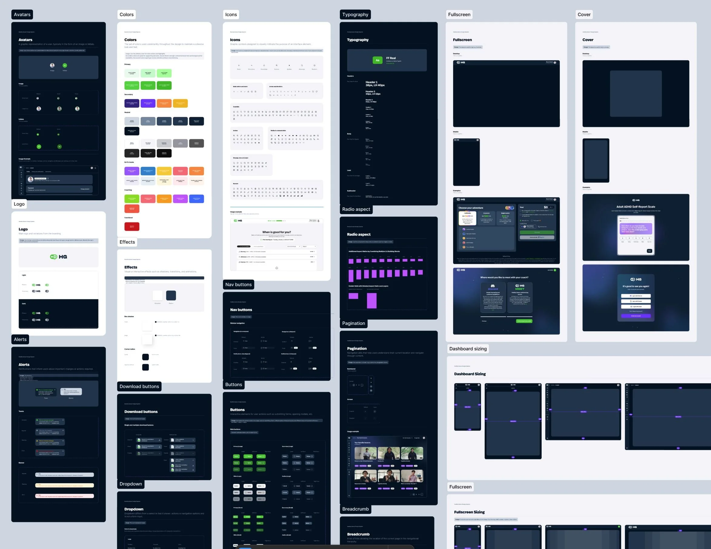
My first mission was to successfully migrate all of the various existing designs from a multitude of sources into Figma. After completing this huge task, I then had to identify, index, and redesign all existing components, as well as those that were missing, in order to establish a comprehensive and solid design system for the production team to effectively use.
WORKING WITH DEVS
One of the most important things I have learned during my career is that a design is ultimately made to be turned into code. This might sound basic at first, but as a product designer, I always ensure that the organic connection between design and code is maintained and nurtured.
With my experience as a Lead Front-End developer, I understand the technical constraints and the way developers approach building a project. Our design system needed to provide the necessary momentum for developers, guiding the process toward a solid, well-organized, and accessible final product.
TOKENS TO LAYOUT
One of the first principles I wanted to implement was a clear hierarchy of elements within the design system. I established the different stages of design as tokens, components, and modules. This naming convention would serve as the core structural matrix of the entire design system. The primary goal was to maximize the reuse of components and modules wherever possible, while allowing for the creation of unique components whenever a specific feature required distinct behavior or functionality. This approach ensures consistency, scalability, and efficiency throughout the design process.
The usage of the design system file in Figma was limited to those principal:
Global components only
For every component that are global to the platform.Feature related component
Components related to a specific feature should be included in the feature file only.Migration
If one feature related component needs to be used in another feature, it can be migrated to the design system file so it can be used globally.

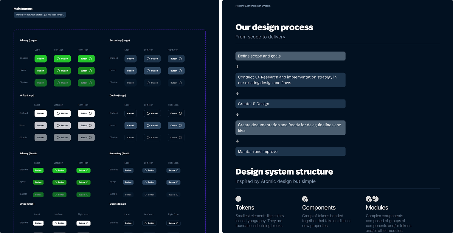
A healthy system starts with good documentation
With the structure set, I helped devs implement the design system. Tight deadlines meant I couldn't create documentation before front-end work began; we needed to launch the design platform quickly.
Once the first version of the new design was successfully implemented, I made sure to add comprehensive documentation for future features. This approach helps reduce friction between design and code, ensures a smoother QA process, and allows developers to easily understand the intended behaviors and underlying logic.
The documentation was created in Figma and so accessible to all. When writing documentation, I wrote to three different levels depending on the component.
Specs – Detailed breakdown of the component, it’s states and it’s behaviours
Guidelines – When designers should use this, when they shouldn’t
Ready for devs - When devs implement a component, they have a complete guide of how the component should behave, interact and animate.

Key takeaway
This project provided me with a valuable opportunity to build a comprehensive design system, with the responsibility to carefully analyze, deeply understand, and effectively make the most out of an existing design.
It was a work of patience as I needed update pieces by pieces keeping in mind a global vision of what the entire platform. But the most important thing was to allow other to improve efficiency, consistency, and collaboration, while also reducing technical debt and enhancing the UX and UI quality.
DO NOT GIVE TOO MUCH ROPE
Another aspect of the project was establishing clear processes and onboarding the production team and other departments into Figma through workshops and instructional documents. Involving new departments taught me that too much freedom can cause issues:
People commenting on in progress designs
Accidental deletion of mockups
Misunderstanding of the process (Ideation > UX > UI).
I had to ask for more clear and detailed project management processes and instructions so that everyone involved knows exactly what they can or cannot do at each stage of the project.
PRESENT AND FUTURE OF THE PROJECT
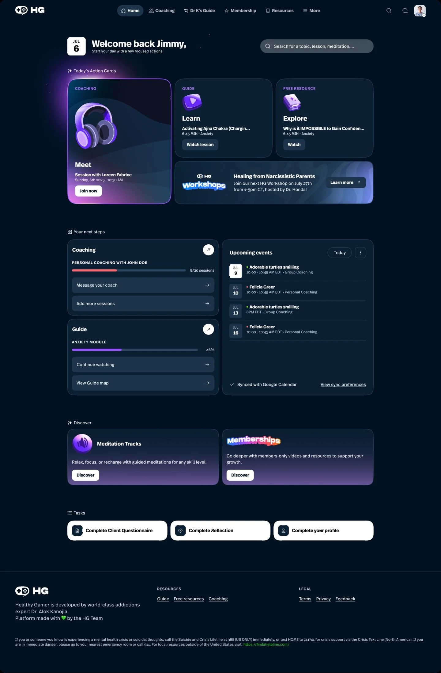
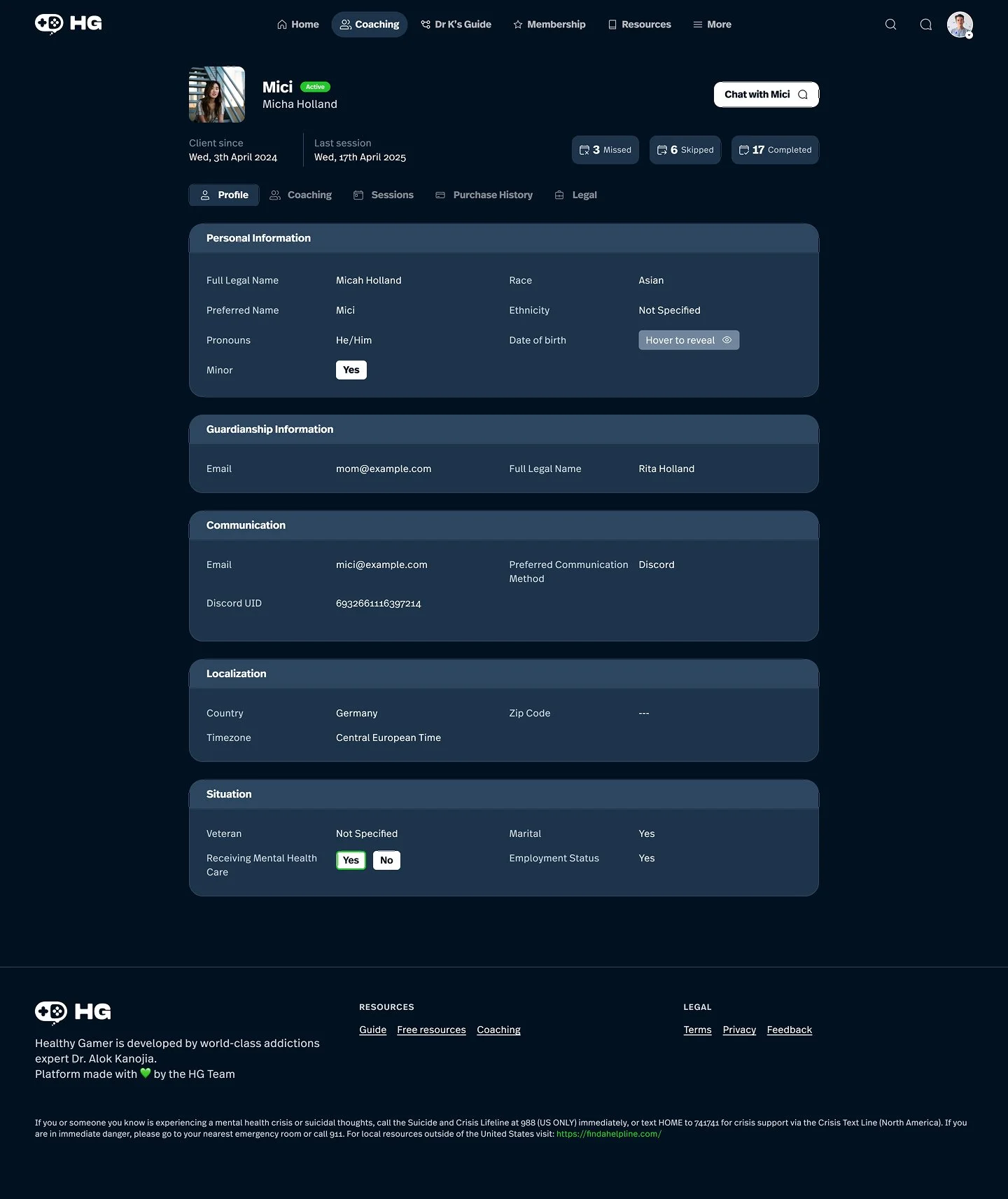
The design system is still evolving and adapts as the platform’s design grows. So far I have designed around 20 interconnected features that continuously test the system’s robustness while enhancing its flexible capabilities.
VARIABLES ARE YOUR FRIENDS AND ENNEMIES
Another thing I learned is that Figma variables can easily turn into a rabbit hole. They offer great flexibility and powerful customization options but can end up creating components that are overly complex, with too many variations that make their usage unclear and difficult to manage. Through experience, I discovered it’s best to create smaller, manageable bites and separate sibling components rather than one massive one. Additionally, implementing clear and consistent naming conventions has been essential to keeping everything organized and easy to navigate.